Does Color Matter?

Share on social

In marketing and design, color choices are used to influence emotion. Something as simple as color can completely change how someone will feel about a product, brand, image, service, etc. This influence is driven by two main things: associations and context. Most people will have different associations to a color (or colors) based on their experiences or interactions in their lives. Some associations though, tend to be pretty universal, which means they can be used reliably to communicate.


The other important factor is context. On food packaging, red might be a good choice because warm colors can stimulate appetite, but on the other hand, the color red in terms of color theory can invoke danger and negativity, making it a somewhat risky color to use in such a context. The key to color in marketing and branding is to know the right applications, associations, and contexts. This is why color theory and application is a required study as part of any fine art or graphic design degree.


In relation to color theories and predictions, Pantone, the industry standard in color specification, announces a “Color of the Year” to try to predict hopes, trends, and expectations for the upcoming year. For 2021, they selected two colors – illumination yellow and ultimate gray. The choice to feature two colors can be interpreted to represent coming together in solidarity, an idea we all hope we can achieve moving forward. Yellow often represents feelings of hope and optimism for a better year, while the contrasting gray creates feelings of calmness, stability, and resilience. Although colors can’t change how the year will play out, they can absolutely communicate a message of hope that may give us some reassurance moving forward.

Many people tend to choose colors for their projects based on their personal preference or what colors they think might stand out the most. When thinking about how to market a brand or product, choosing a color that YOU think looks good is not always and shouldn’t always be the goal. 


While questions of context and personal experience make it hard to be confident in color, understanding color psychology can be a good starting point to making sure you’re telling the right story. The best option is to work with design and marketing professionals so they can help determine what colors will communicate the right message and attract the right audience for your brand.


When thinking about color, it can be helpful to know some common color associations. Based on studies by Faber Birren, warm colors (red, orange, yellow) are stimulating and can make time feel like it passes slower, while cool and soft colors (blue, green, purple, gray) are relaxing, promote focus, and can make time seem to fly by.

Here’s a summary of some other perceptions people tend to have about colors (if you’d like even more color information, click here).

Red is a powerful color associated with strong emotions. It can mean passion, love, fear, danger, anger, strength, energy, heat, or importance. Red can be very useful for grabbing attention to important information such as sales or warnings, but it should be used cautiously since it has the potential to represent some strong negative emotions.  

Orange also draws a lot of attention, but it has fewer risk of negative connotations. It’s often associated with fun, warmth, food, shelter, enthusiasm, and motivation. This makes it a common choice for games and sports, as well as fruits and snacks.  

Yellow’s brightness makes it an energetic color choice. It is perceived as happy, enthusiastic, optimistic, confident, and inspiring. Because it draws so much attention, it can also be seen as a warning, such as on caution tape or traffic lights.  

Green has a diverse set of associations tied to it. It can mean nature, health, organic, growth, wealth, logic, rest, and peace. In general it has few negative associations, but can sometimes come across too materialistic because of the connection to money.  

Blue is a soothing color, associated with responsibility, calm, cleansing, reliability, and trust. But it can also signal cold, which can make it seem distant or unfriendly if used in large amounts. However, it’s a very well-liked color, which makes it a dependable choice.

Purple creates a good balance between energy and reliability. It’s frequently associated with royalty, luxury, mystery, and magic, but also with loyalty, courage, and creativity.  

Pink is often most heavily associated with femininity and sweets, but it also represents compassion, caring, understanding, and sensitivity. It can be a nice accent for florals, but can sometimes come across as immature when used in excess.

Brown is thought of as secure, structured, and safe. It can also be earthy and make things feel organic, but is sometimes criticized for being boring.  

Black, like red, is a powerful color with many meanings. It can mean sophistication, control, independence, stability, and power, but it can also mean evil, dark, mystery, depression, and death. It depends on context, but black is a diverse color and usually works well if not used in excess.  

White is associated with cleanliness, purity, peace, and innocence. It can be powerful in creating contrast, but too much white can create a feeling of emptiness or isolation.  

Gray elicits feelings of calm, stability, focus, relaxation, and resilience. It could also be seen as uncertain or stormy, depending on context. When there’s too much of it, it may come across tired or dull.  

More Posts

Does Color Matter?

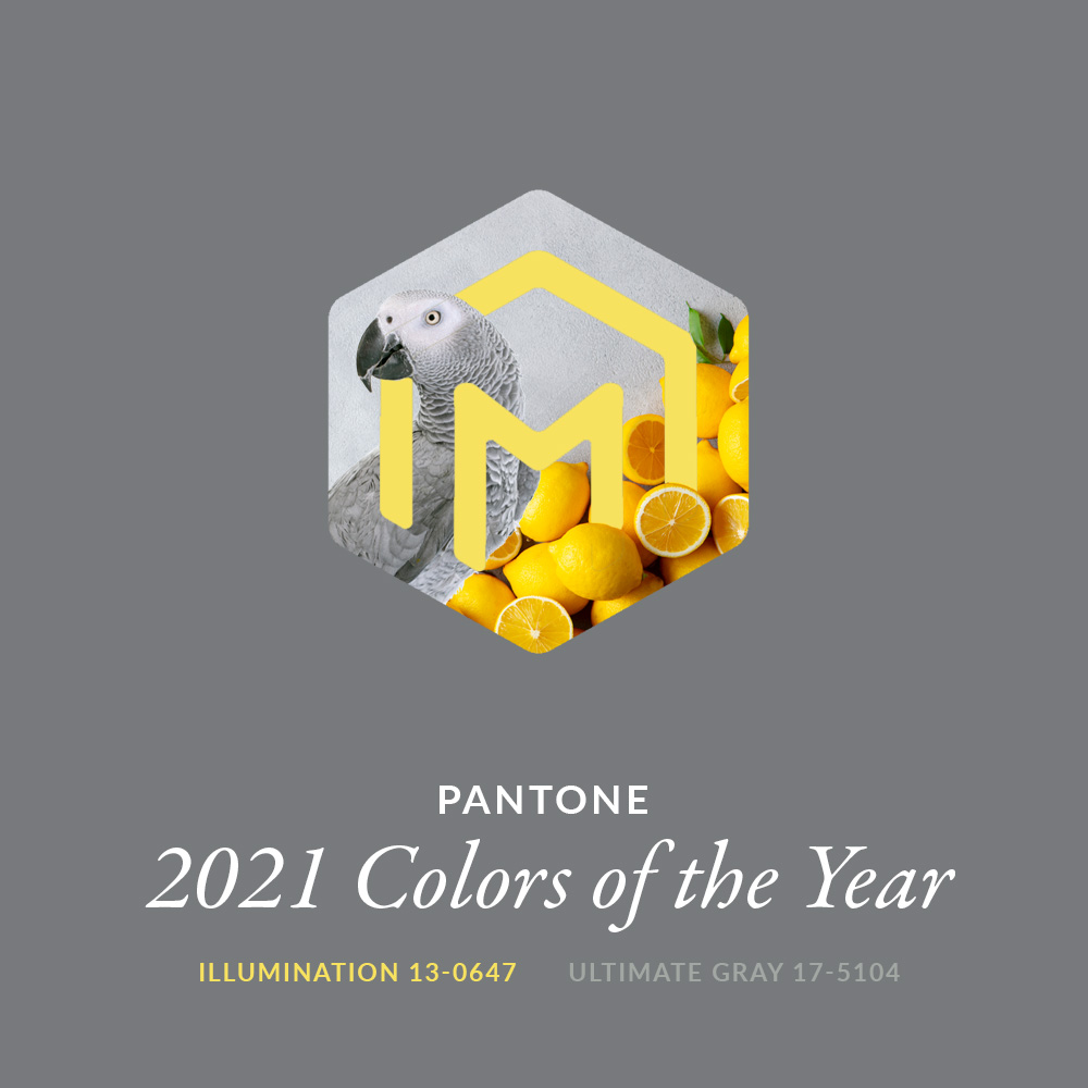
In fact, some ancient cultures even used chromotherapy – the use of colors to heal.1 Color researchers today are skeptical of any “curing” powers in color, but most tend to agree that color can have a marked effect on emotion and mood.

Read More »

Why You Need a Design Agency

With all the longevity, training, and experience of the ad/design industry, companies are still questioning whether or not they “need” a design agency. Here are our thoughts on the subject.

Read More »

Women’s Small Business Month

We thought it might be the perfect time to talk a bit more about our WBENC certification and the importance of supporting women owned businesses, especially in the creative/marketing industry.
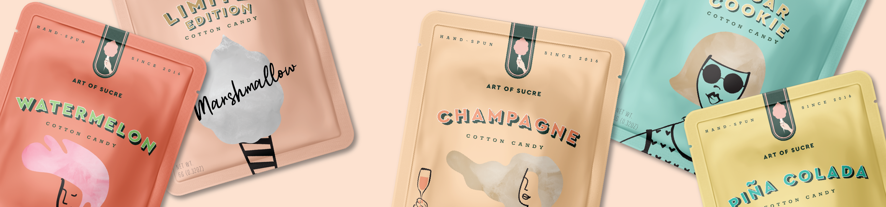
Read More »

Colorado Ad Day: Recap

Without knowing too much of what to expect in our first year attending, Colorado Ad Day delivered. Read our summary review of a day full of marketing, inspiration and empowerment.

Read More »

Let’s start on a project together.